


Primary colors
Dark Green
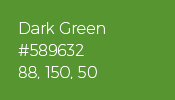
HEX: #589632
RGB: 88, 150, 50
CMYK: 70.53, 18.84, 100, 3.7
The QGIS Dark Green color to be used for every logo element in the monochrome version. It can also be used as background, primary headline or text color.
Light Green

HEX: #93b023
RGB: 147, 176, 35
CMYK: 50.62, 12.6, 100, 0.86
The QGIS Light Green color to be used for content of lesser importance. It can be used as secondary background, text or links color.
The gradient
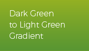
The two primary colors are used as a vertical linear gradient in the logo, and this gradient can be used for website and printed materials background
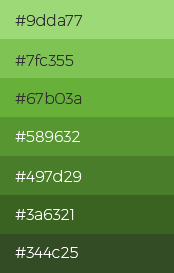
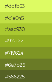
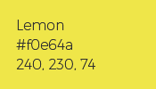
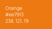
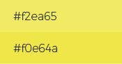
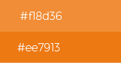
Color Palette